Healthcare Portal Redesign
⌛ ~3 min read
Project Info
Role: Product Designer, UX Researcher
Timeline: 1 year (running alongside other initiatives)
Launched: January 2026
Team Structure: 1 Business Analyst, 3 Designers, 3 QAs, and 6 Developers
Impact
Reduce 27% of support tickets currently related to navigation and permissions confusion.
90.4%(version A) and 84.6%(version B) task completion rates in A/B testing.
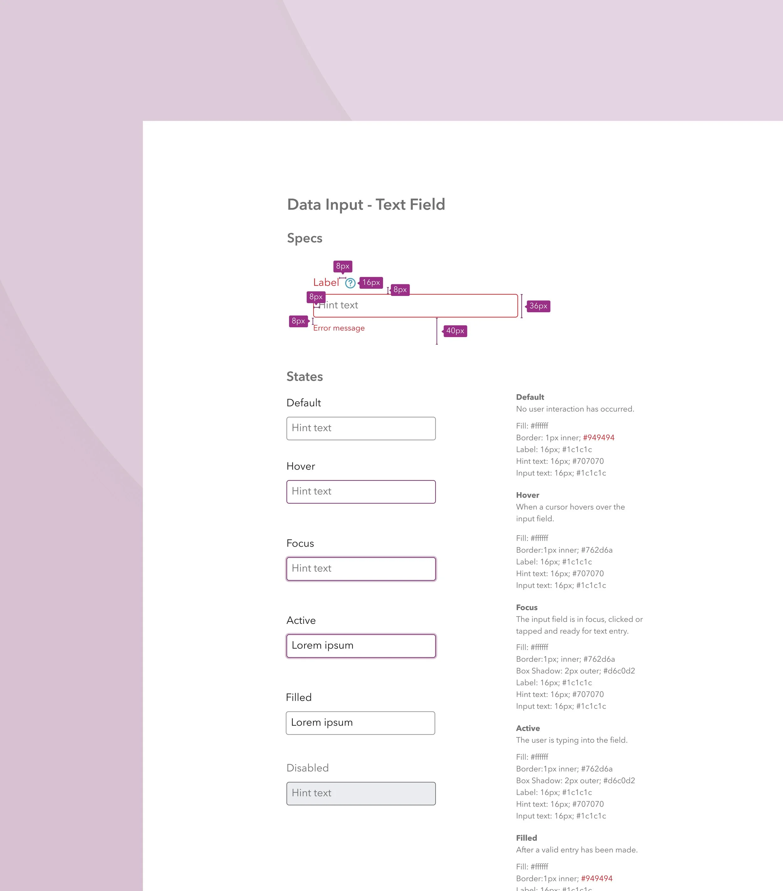
A comprehensive design system with new components, interaction specs, and accessibility guidelines.
Turning Tech Debt into a UX Opportunity
The project started as a technical upgrade with new frameworks and updated components. For engineering, this was a clear win. But it raised a question for the rest of us. If we're touching the front-end, shouldn't we also rethink the experience?
To answer "if it ain’t broken, why fix it?"—I gathered evidence from user interviews, competitor analysis, and a UX audit. The greatest friction turned out to be not knowing what needs to be done and when.
In a field where insurance paperwork and prior authorizations already feel like a second job, initiatives that reduce cognitive load and free up energy for care can deliver significant business value.
When "Redesign" Means Different Things
With the business case established, the next hurdle emerged: alignment.
What does a portal redesign really mean?
Developers pictured a streamlined codebase. Business stakeholders saw a chance to boost compliance and reduce support tickets. And Designers? We wanted to overhaul the entire experience.
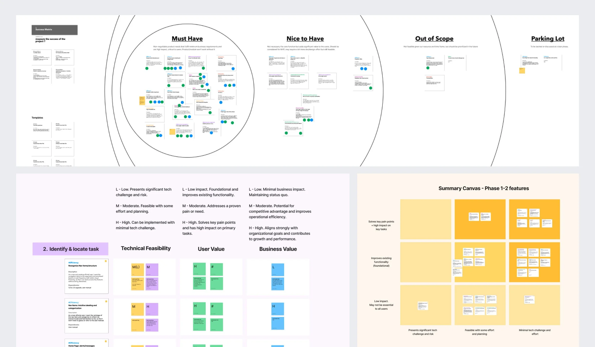
So before sketching a single wireframe, I brought together design, engineering, and business leads for a two-part co-creation workshop. In the first part, Design and Business leads agreed on priorities based on user friction and business impact. Then, Developers, QA, and the Product Owner pressure-tested those priorities against technical realities. The conversations set clear boundaries early. Without it, we would have moved faster — but likely in the wrong direction.
This exercise didn’t eliminate scope changes, but it did minimize scope creep and secure early buy-in on how we prioritized the work, balancing immediate UX debt with long-term investments that compound value.
Multiple Roles, Unified Experience
With alignment in place, I shifted focus to the users themselves.
The portal serves a wide range of users with very different needs. Internal care managers and program directors troubleshoot issues by simulating provider workflows. External clinicians and staff juggle time-sensitive compliance reporting amidst a packed schedule. So, how did we create a navigation system that works for everyone?
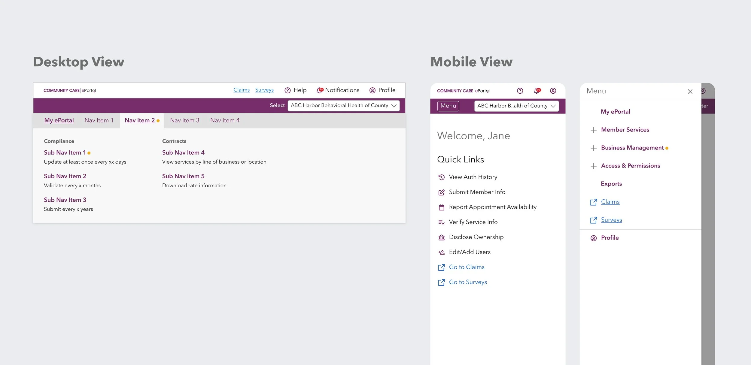
I started with what users had in common. Regardless of role, all users struggled with vague menu labels and poor task prioritization. Even though the existing information architecture and access configuration needed to remain untouched, I could still change how users perceive the system—through clearer language, smarter shortcuts, and streamlined notifications.
The menu labels were proposed by internal users and validated through tree testing with 101 external providers.
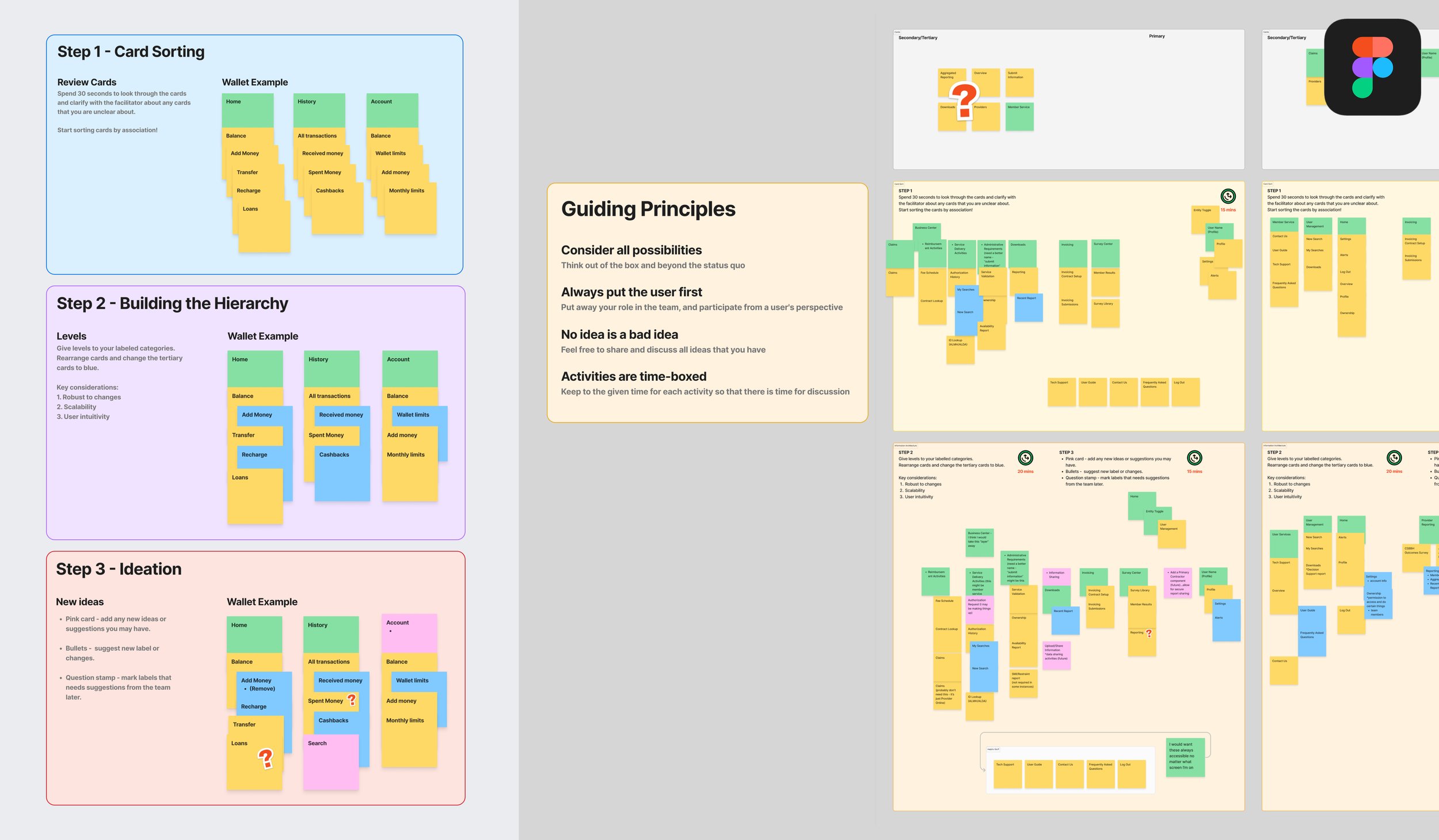
Menu label brainstorm workshop with internal users
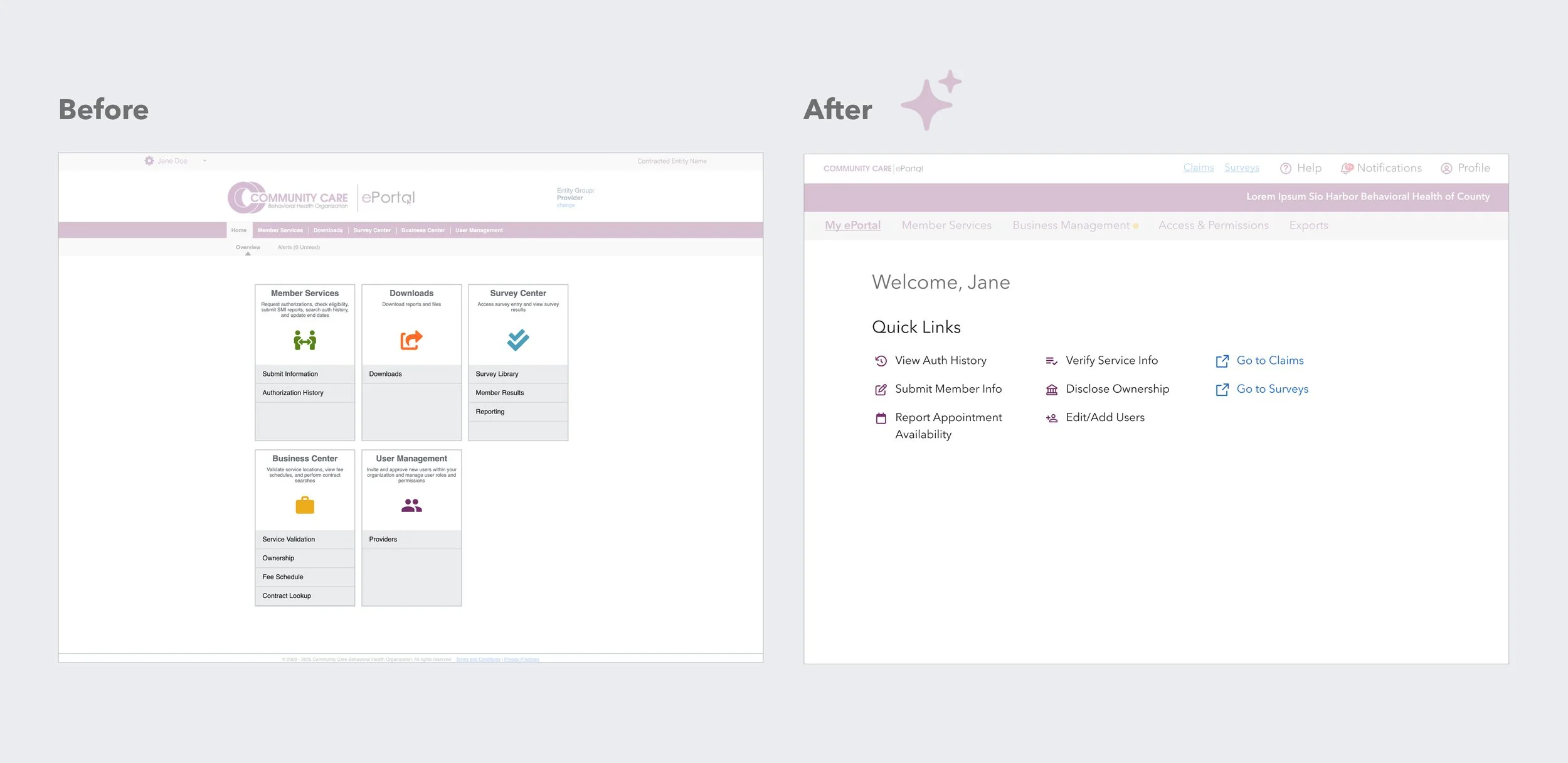
The home page houses shortcuts to frequently used features, and thanks to the established access configuration, users see a different set based on their role.
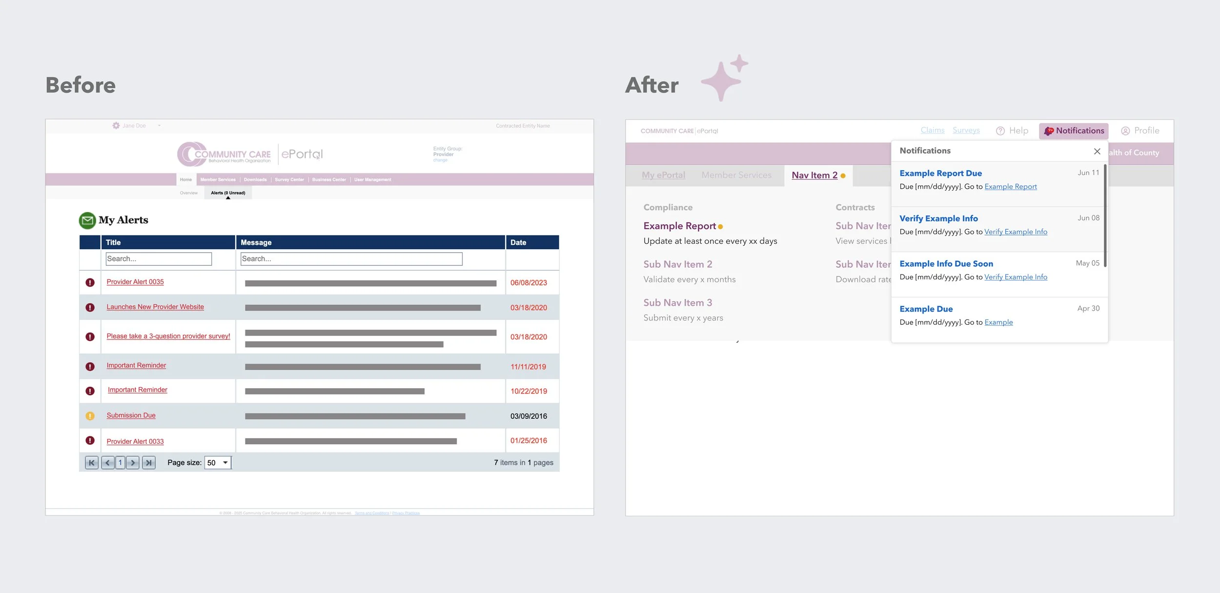
The cluttered My Alerts page was replaced by a lean notification system that spotlights task-oriented reminders for providers and system updates for internal users.
The result was an experience that flexes to different user contexts without requiring a complete structural overhaul.
From Testing to Trade-offs
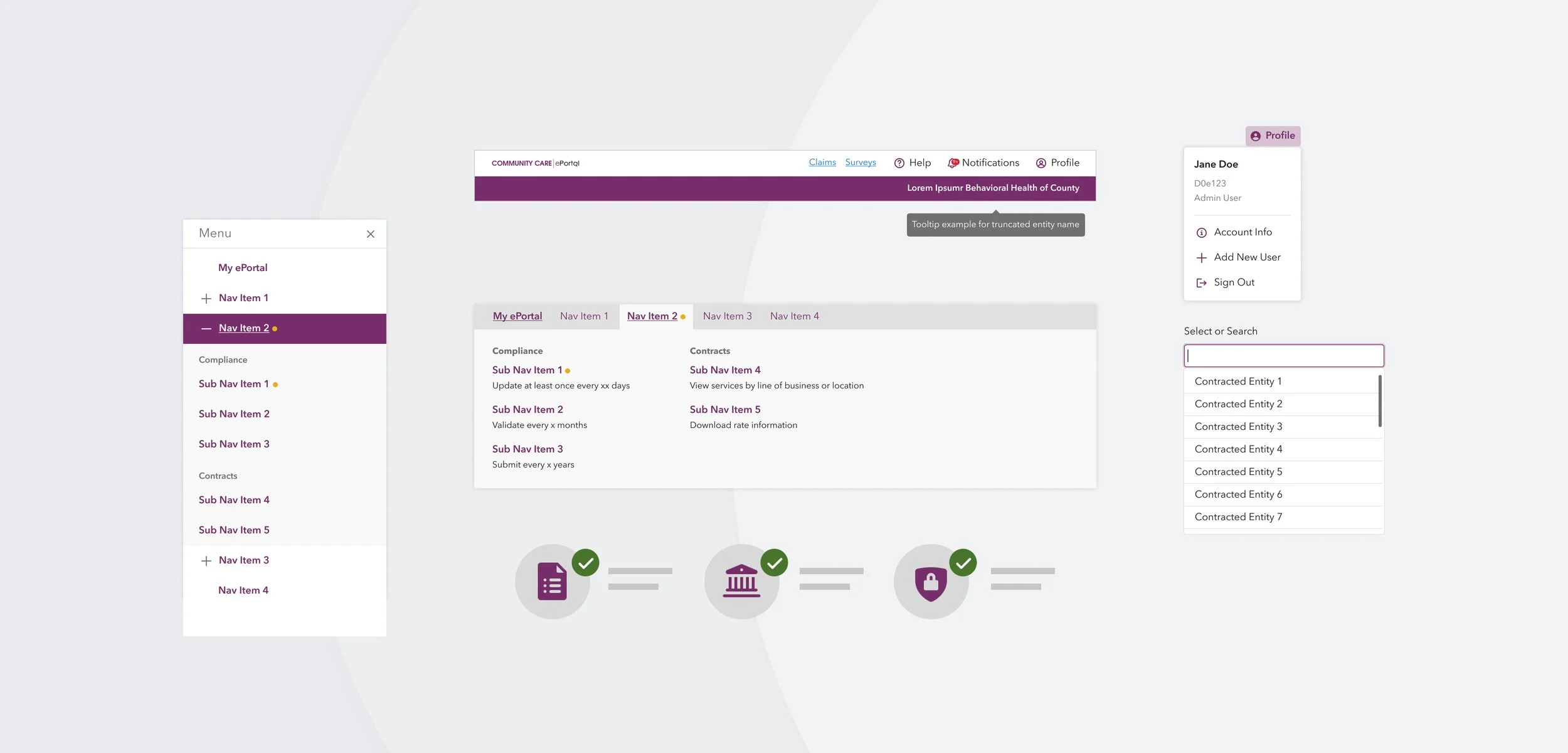
With the navigation structure and home page content charted, the next step was designing an interface that met the portal's requirements for web accessibility (WCAG AA), responsive layout, and the new component stack.
The initial user test presented a conundrum. Two concepts, shaped by earlier usability findings, were tested. Option A was optimized for focused task completion, while Option B supported more exploratory behavior. Both achieved high task completion rates (90.4% vs. 84.6%) with user preference split evenly.
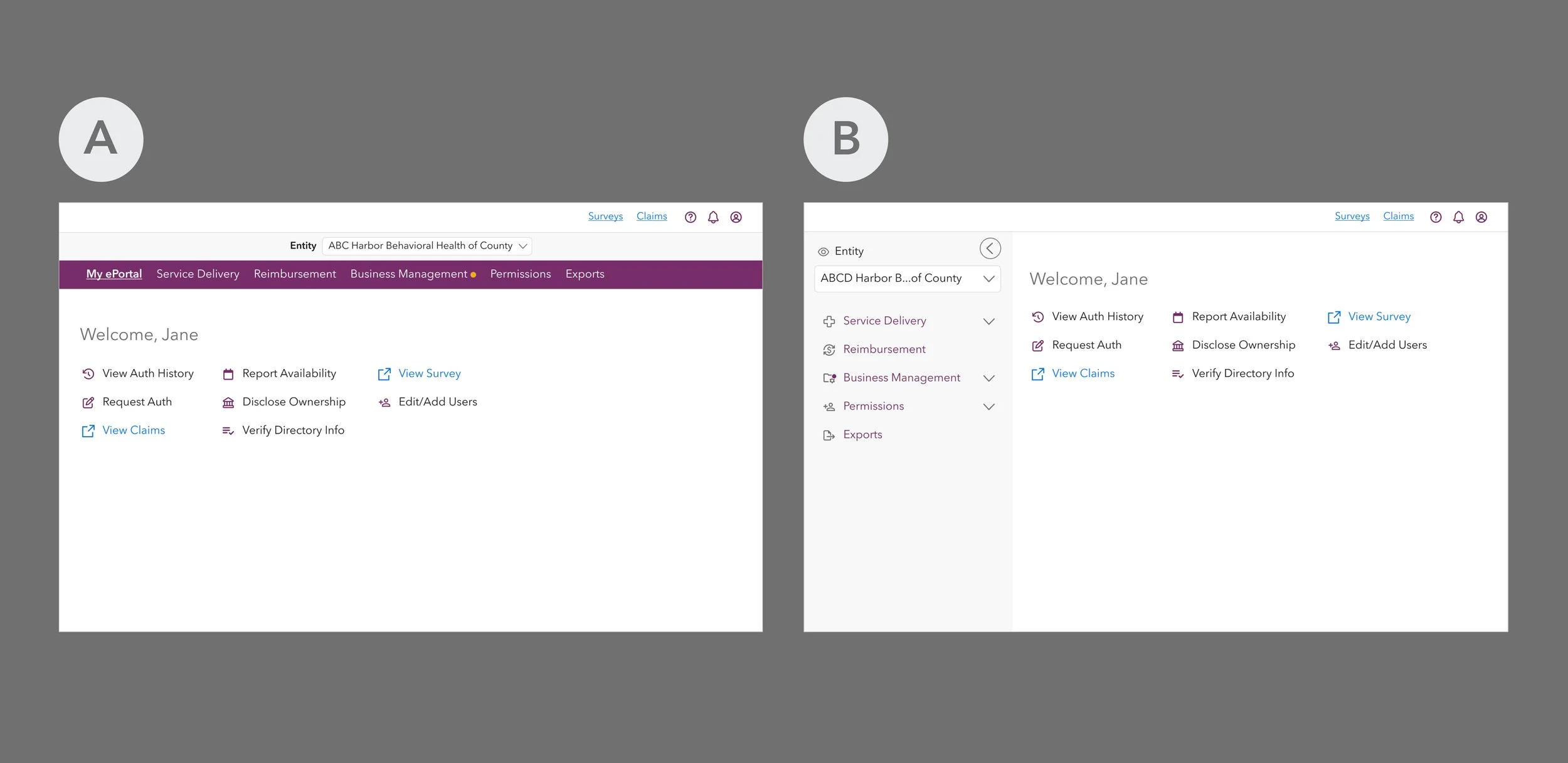
When data didn't break a tie, we turned to the practical stuff—how much engineering effort would it take, could we iterate on it easily, would it scale well, and most importantly, how would it affect our users?
After much debate, a hybrid approach was chosen that took the best parts of the two options. The top-down navigation was chosen for the desktop experience as it required moderate implementation effort, felt familiar to both new and experienced users, and could be built using existing components. A sidebar design inspired by Option B was adopted for smaller breakpoints, maintaining the same top-level information architecture while being touch-friendly.
Every decision has its trade-offs, and waiting for a clear winner costs time and momentum. What moves a product forward isn't a perfect answer. It's a clear rationale the team can stand behind.
What Rollout Taught Us
The redesigned homepage is live as of January 2026. This case study will be updated with success metrics later, but until then, here's what I've learned.
To help guide the implementation of a component library, we created a comprehensive design system. The documentation was thorough. The specs were clear. But documentation doesn't ship products. Collaboration does.
When the Design team stepped back to let engineering lead execution, we lost visibility into implementation decisions. By the time we identified the drift between design specs and coded components, there wasn't enough time to course-correct. In the end, we had to ship with available components while the rest of the component library was on hold.
What I'd do differently? Establish shared checkpoints earlier and stay closer to implementation as a listener. Stepping back doesn't mean stepping away. It means staying connected enough to course-correct before it's too late.