
Availability Report Tool
⌛ ~3 min read
Project Info
Role: Product Designer
Timeline: 2 months for planning, research, and design
Launched: December 2023
Team Structure: 1 Business Analyst, 2 Designers, 3 QAs, and 6 Developers
Impact
Delivered 50,000+ contracted location updates since launch
Monthly capacity data is integrated into the member-facing Provider Directory, providing transparency across seven critical mental health levels of care
*Note: Some details have been modified to protect proprietary information.
Designing for Data Nobody Wanted to Give
Behavioral health providers in this country are underwater. Staffing shortages, mounting waitlists, administrative burden — and somewhere in the middle of all that, a reporting requirement asking them to log appointment availability every month.
That was the starting point for this project. A regulatory obligation that needed a tech solution.
But after speaking with care managers, the real problem turned out to be relationships. Providers weren't withholding data because reporting was cumbersome. They simply didn't trust what would happen if they answered honestly. And no amount of UX polish was going to fix that.
At that moment, I knew what we built wouldn’t be the solution the problem deserved. But it was the right starting point for what the organization could actually ship, and understanding that difference is what this case study is really about.
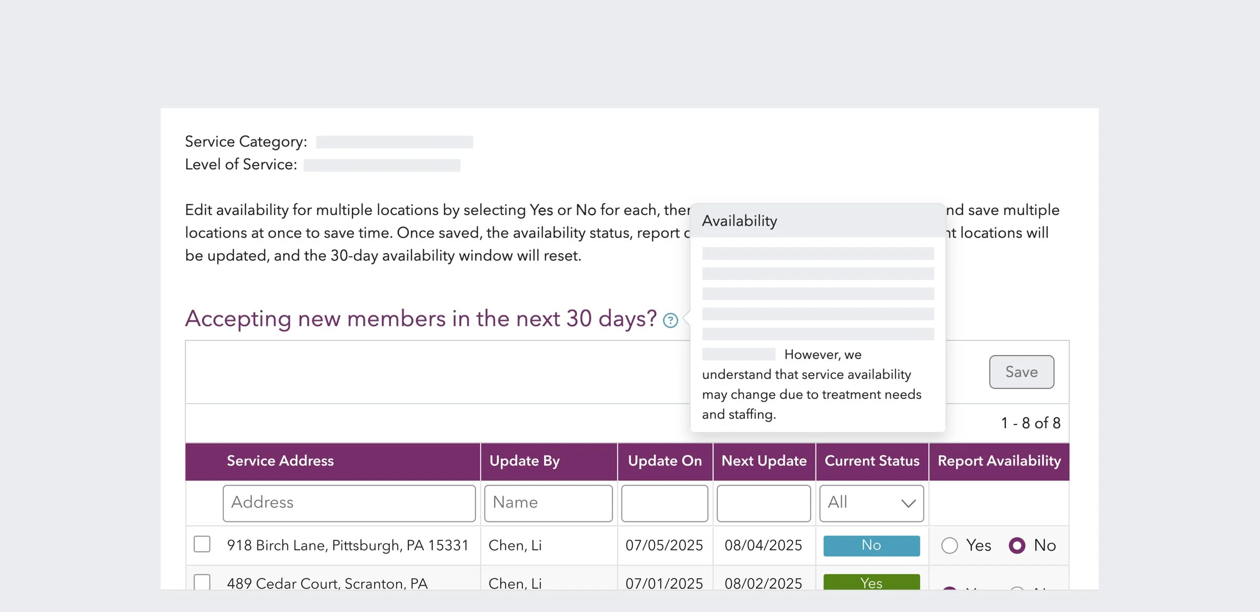
*Availability report final design
The Data Existed. The Trust Didn't.
Before defining an approach, I spent time with care managers who coordinate provider relationships daily and understand availability in ways no dashboard ever could.
With a vast provider network to manage, care managers already had reporting workflows in place. These included templated emails, monthly capacity reports, and weekly census calls. I wasn’t filling a gap; the project was asking providers to do something they were already doing, for an audience they trust less.
Providers were reluctant because saying no felt like a risk. The risk of being challenged or held to a commitment they couldn’t keep, knowing how quickly staffing situations change.
The only thing that could motivate sustained reporting was closing the loop. If submitted availability meant fewer inbound calls and better-matched referrals, there was something in it for providers. But building that loop wasn’t on the table for phase one.
Aiming for a Foundation, Not a Solution
The research pointed toward a richer solution. One that captured wait times, referral preferences, staffing context, the kind of nuance that actually helps a care manager make a good match. The original brief had gestured toward something like that too, with a 16-question survey.
We shipped one question.
Accepting new members in the next 30 days? Yes or no.
The decision wasn't made lightly. But this was a reporting structure that could realistically be completed monthly without requiring dedicated provider staff. A single binary question also lowered the stakes of answering honestly — the more providers committed to, the more they could be held to.
So, within that constraint, I designed a reporting interface to support honesty and ease. The new feature supported batch reporting for providers managing 20+ locations and allowed shared access across teams, making it easier to compile availability data. I also included help text that explicitly acknowledged the frequent staffing and availability changes, so no one would be penalized for updating their status when things changed.
What we gave up, of course, was data accuracy. A “yes” doesn't tell you about the 12-week wait, the insurance restrictions, or the specific population a provider can actually serve.
The trade-off was deliberate. Get providers into the habit of reporting something first, establish the infrastructure, and use phase one data to inform the next step.
It was the right starting point. Whether it was treated as one is a different question.
Supporting Member Through Visibility
Instead of simply checking off the box for meeting compliance, our team used the self-reported availability data to power an availability layer in the member-facing provider directory.
Now, when members searched for child and adolescent behavioral health services, they could see whether a provider had reported availability and when. The data wasn't comprehensive, and members might still need to make calls, but it provided more visibility to help them navigate a fragmented system.
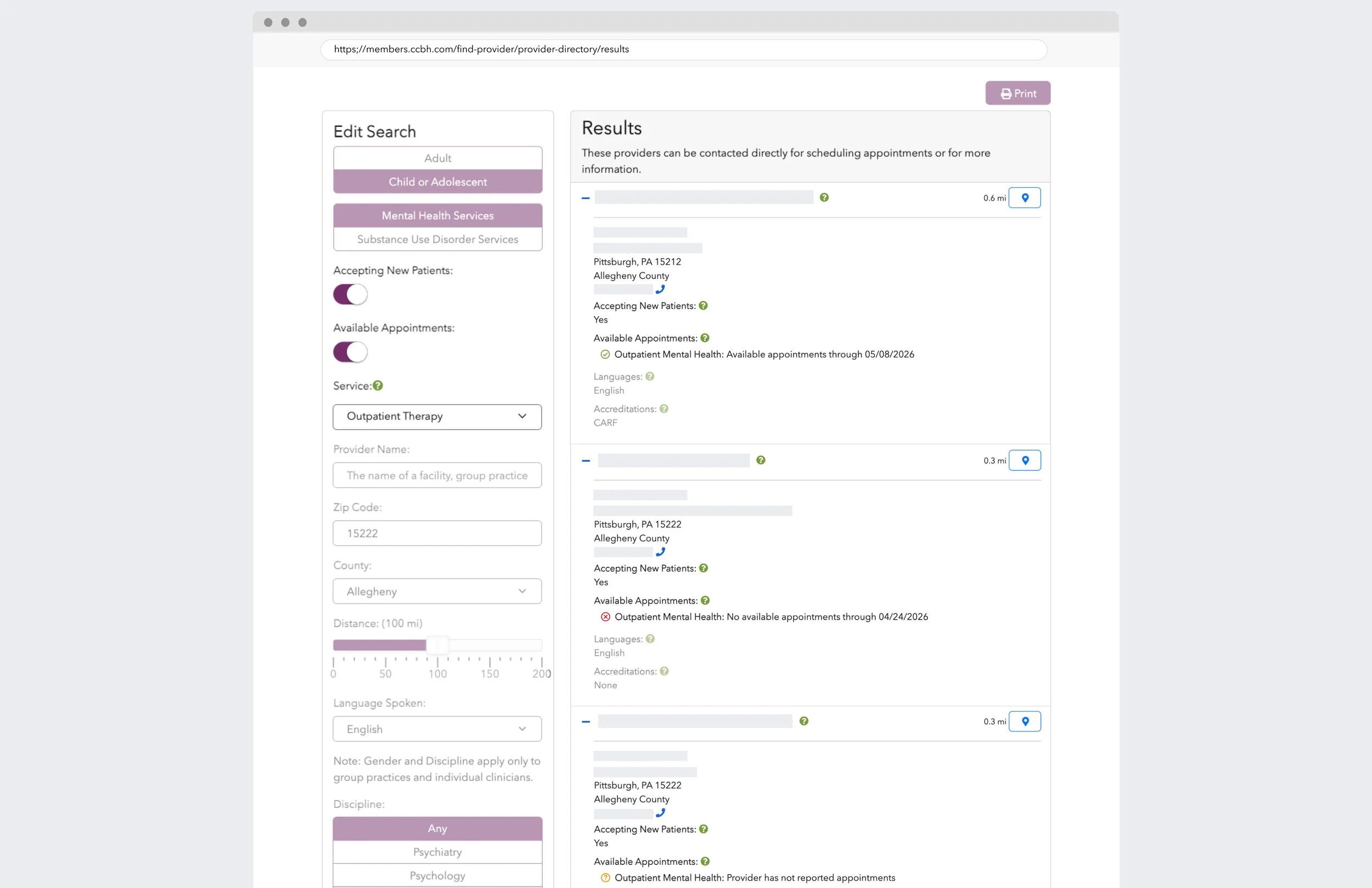
Member-facing Provider Directory
Good Enough to Try. Not Enough to Return.
A year of data confirmed what research told us would happen.
Monthly participation averaged 56%. More than half the provider network reported at least once a month. That's not nothing. It suggested the simplified reporting structure cleared the initial friction barrier. Providers tried it.
But consistency was a different story. Only 6.6% of providers reported every month. Nearly 90% reported once, and then the drop-off was steep. By month three, participation had fallen to 78%. By month twelve, only a small fraction were still showing up.
Without any monetary incentive or a closed loop that either reduces inbound calls or improves referral quality, there was no reason to keep coming back. Voluntary reporting, no matter how easy, has a ceiling.
Phase one got the data flowing. It proved the infrastructure could work. But the participation pattern made it clear that the next phase would need to solve for something deeper than ease of reporting.
Provider Obligation vs. System Capability
So what is the problem underneath the problem?
Availability reporting will always struggle as long as it's framed as a provider obligation rather than a system capability. The research showed care managers already collect this data through their own workflows. It's just inconsistent, unstandardized, and siloed by region.
A standardized logging system for care managers would capture what they're already doing, make it queryable across regions, and establish a more reliable data source than voluntary provider self-reporting ever could.
The other piece is closing the loop. Providers need to see value returned. Not just compliance acknowledgment, but tangible relief, such as fewer redundant calls, better-matched referrals, and visibility into their own network performance. Without that, even the simplest reporting tool is still asking for something without giving anything back.
The industry conversation around behavioral health is shifting from network expansion to precision orchestration — matching the right care to the right person at the right time. Availability data is a necessary input to that system. But it's only useful if it's trusted, timely, and part of a feedback loop that actually helps the people reporting it.
Phase one laid the foundation. The next phase needs to shift focus from obligation to capability.
Other Case Studies
A Decision Aid for Personalized Care
Healthcare Portal Redesign