Partner to Decide
⌛ ~3 min read
Project Info
Role: Lead UX Designer
Timeline: 3 months for research and design
Launched: 2023
Team Structure: 1 UX Researcher, 1 Visual Designer, 1 Project Manager
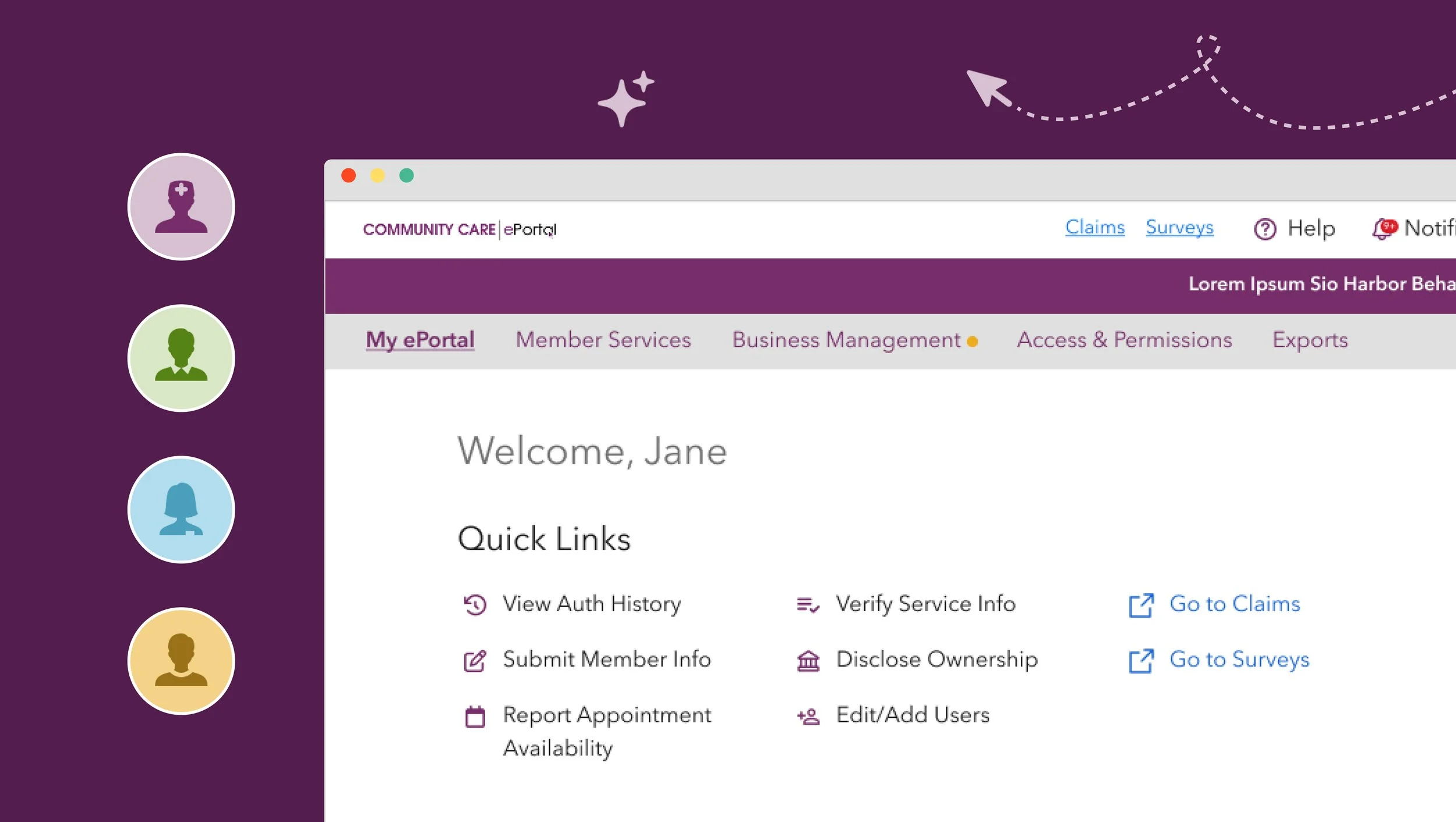
Impact
Secured White House Blueprint funding
Adopted in 2024 by Boston Medical Center, Minnesota Community Care, and the UC San Diego Health System
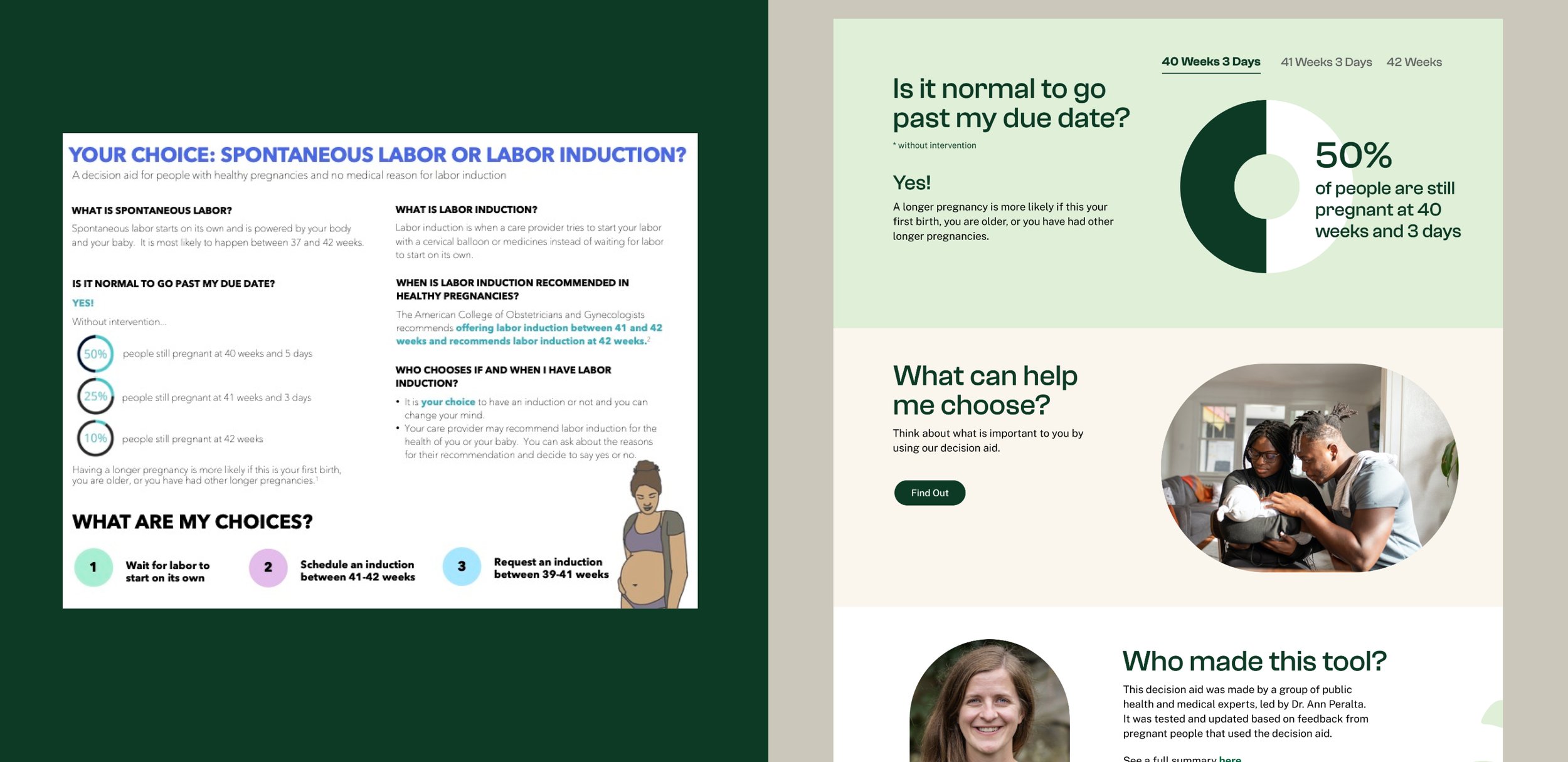
The paper-based decision aid vs. the new digital experience
Our team walked in thinking we were digitizing a paper-based decision aid. What I ended up designing is a decision-making experience driven by emotions and grounded in credible medical facts.
The Briefing vs. The Reality
At first, the project sounded straightforward. The paper-based decision aid, developed and tested by Boston Medical Center and two community health centers, had already proven effective in supporting expectant parents.
But as we dug deeper through interviews with founders, expectant parents, and labor & delivery nurses, a different picture emerged. Expectant parents did not need another digital tool packed with features. What they needed was a guided decision-making experience that met them where they were, both emotionally and cognitively.
Reactions to the concept prototype
Designing for decisions that don’t fit into appointment time
It was just routine, like I was just another patient for the day. He would ask, 'Do you have any questions?' But I felt so rushed that I would say 'No, I don't' and completely forgot the questions.
– Participant 3
Providers often have an average of 15 minutes per visit, much of which is spent educating people about labor induction. That leaves little time for reflection or value-based questions, which are often the most meaningful parts of the conversation.
Instead of trying to fix the appointment itself, I treated the digital experience as a way to extend learning and conversation beyond the visit. From the 12 initial concepts proposed during a co-create workshop, we narrowed down to 3 core experiences that support understanding, reflection, and discussion.
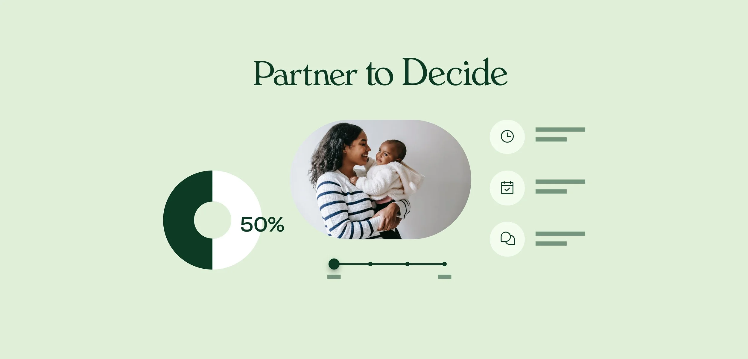
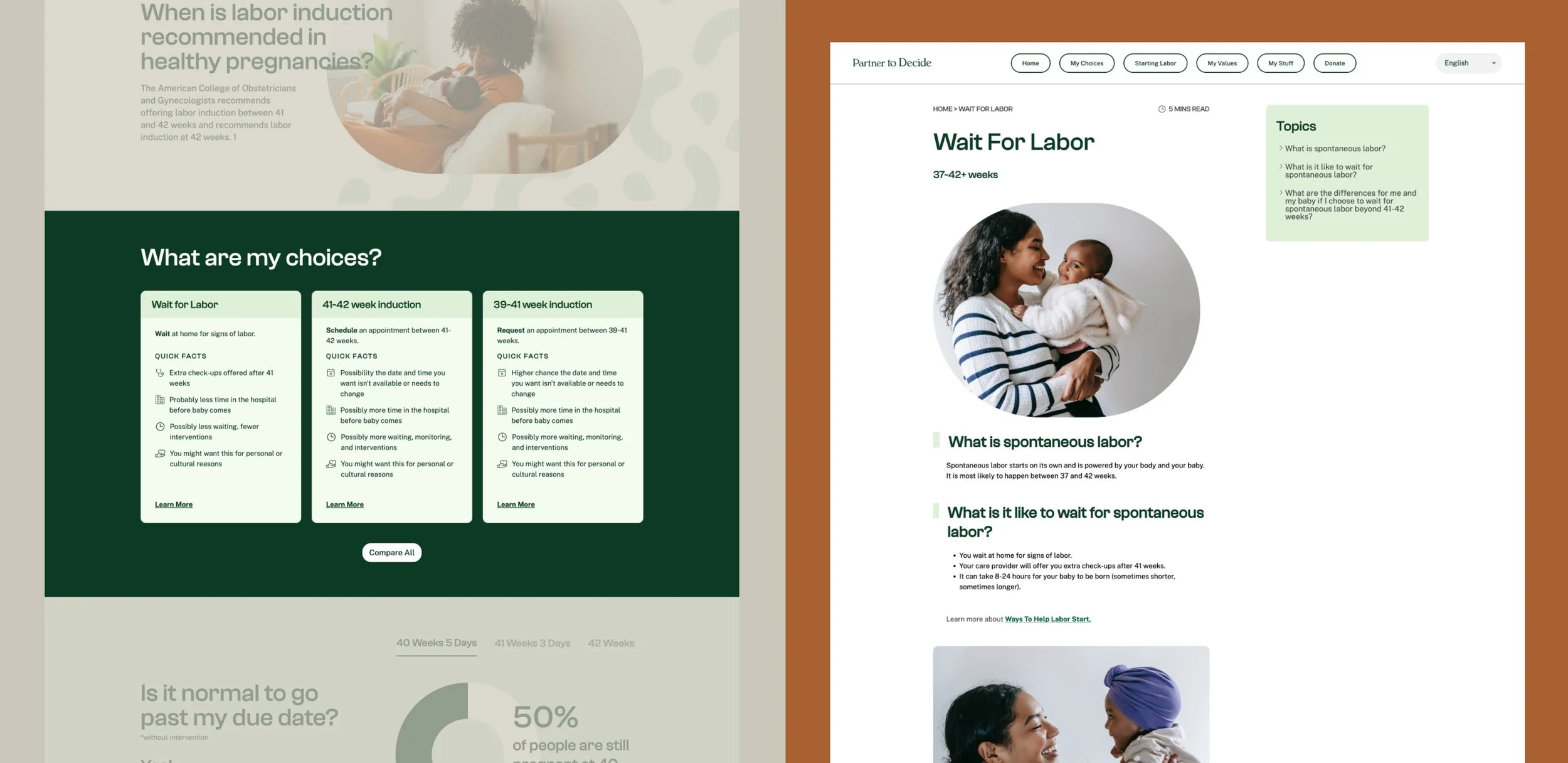
My Choices allows expectant parents to learn key medical facts and labor induction options at their own pace.
My Stuff gives them a place to capture questions as they come up and bring them into appointments.
My Values helps them reflect on personal priorities, such as time in the hospital or level of intervention, that may shape their delivery experience.
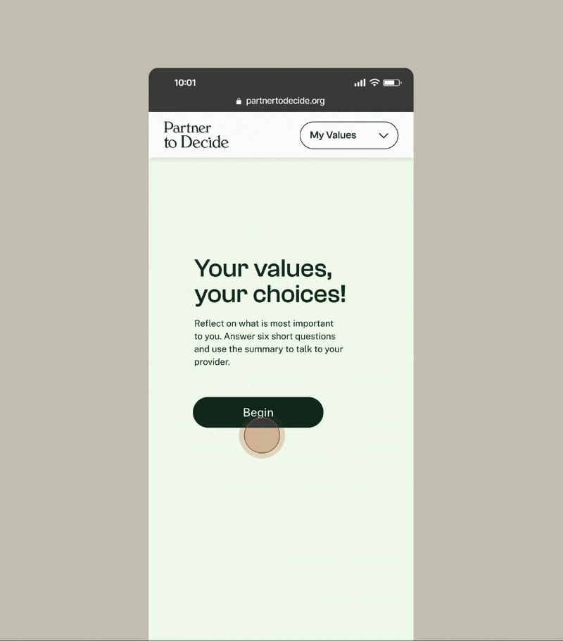
My Values
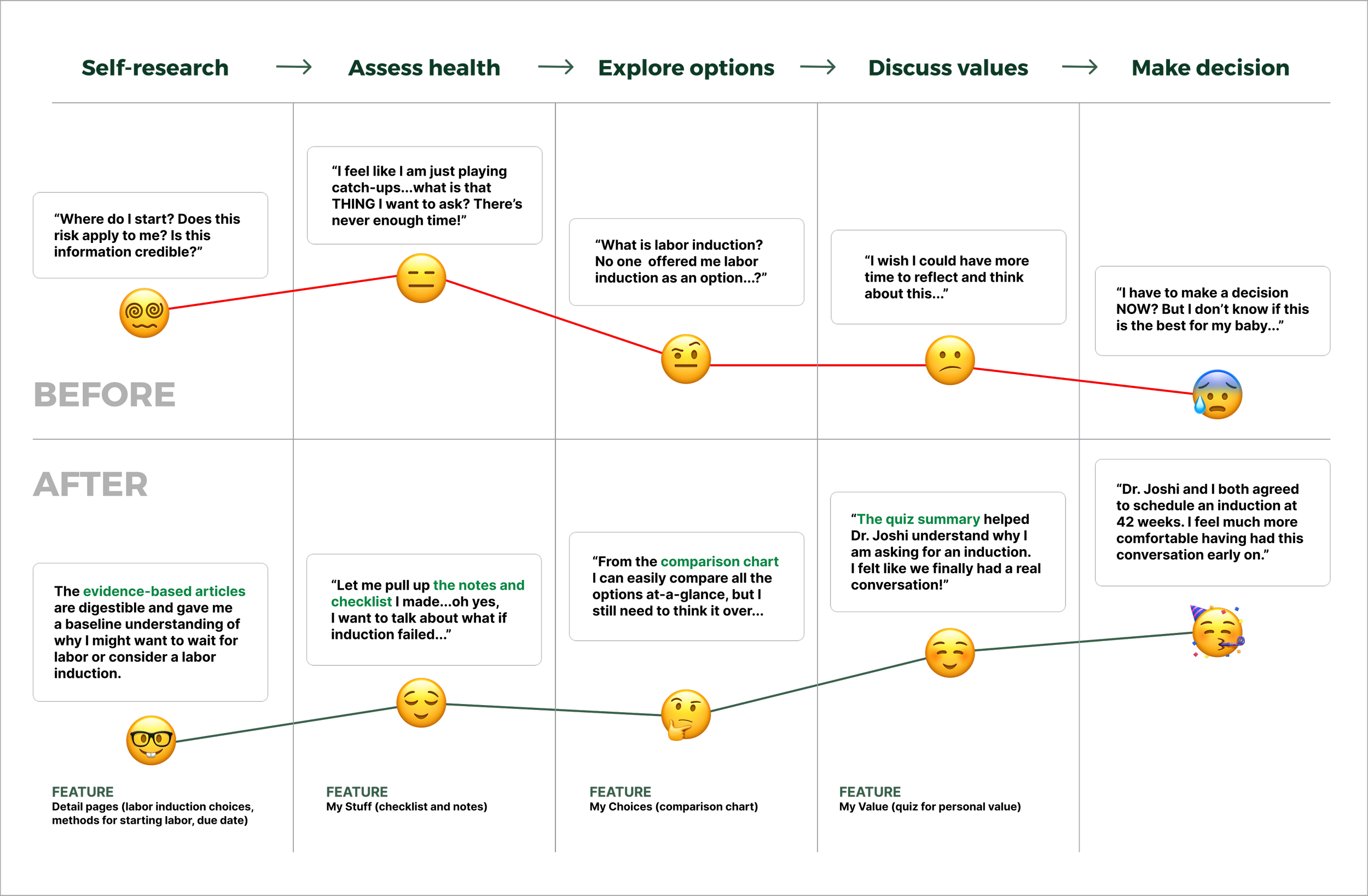
Together, these features created a more constructive conversation, ensuring labor induction decisions were better informed early rather than treated as an afterthought.
Clarity first, and details later
Expectant parents need a basic understanding of labor induction before they feel equipped to discuss options. The challenge was presenting complex medical information to people who were already overwhelmed.
To address this, I designed the experience to lead with clarity before depth. Each labor induction option is introduced through a quick overview that includes a brief definition and a small set of key facts. For those who want to learn more, a link below opens a deeper dive.
This approach gives users greater control over how and when they engage with the information.
Emotion drives product success
As uncomfortable as it may seem to product teams, emotions drive decisions, while logic often comes later to justify them. This holds true even for medical decisions and shaped how we approached trust and control throughout the experience.
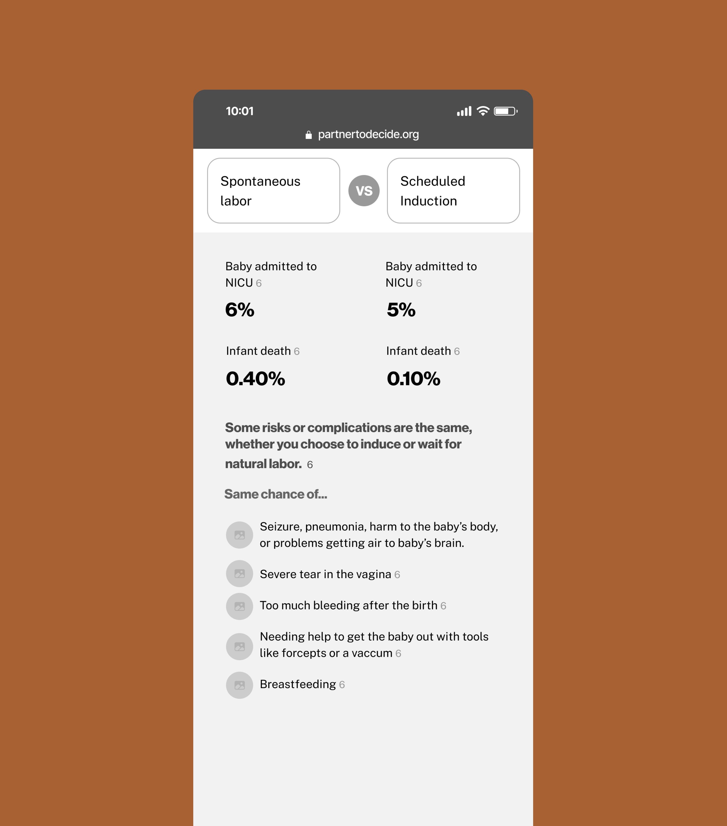
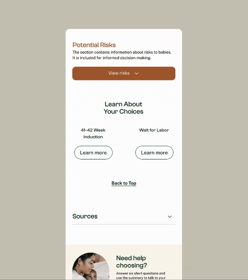
The decision aid is self-paced, which means a medical professional may not always be present to explain the data. During testing, several participants described the potential risks as “something they weren’t ready to think about yet.”
To respect emotional readiness and informed consent, I placed the potential risk information behind a brief disclaimer that users can choose to reveal later.
After all, information is only helpful when people feel ready to absorb it.
Before
After
Designing for handoff, not ideal conditions
This project ran on a three-month timeline, with development handled by an external team. To reduce implementation risk, we focused on low-effort patterns and created a fully interactive prototype to clearly communicate user flows and interactions.
Because of the timeline constraints, ongoing design support was out of scope once strategy and design were delivered. Without shared checkpoints or ongoing ownership across design and development, some responsive behaviors and interactive states were interpreted differently during implementation. The core experience held together, but inconsistencies surfaced at the edges.
Looking back, the challenge wasn’t the handoff itself. It was the absence of a delivery framework that supported iteration after handoff. In similar situations, I would advocate for a structured design walkthrough and lean documentation for interaction and responsive behavior to reduce interpretation gaps. Making sure the product holds up when I’m not there to clarify decisions is part of the job.
Other Case Studies
Healthcare Portal Redesign
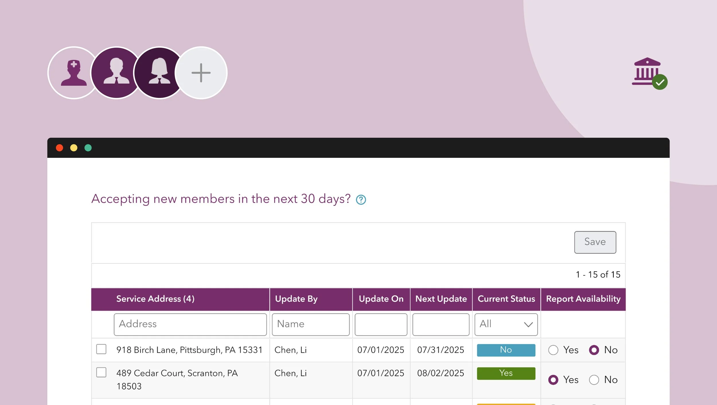
Availability Reporting Tool for Busy Providers